


Oliver Bainbridge Island
Branding
Roles
Brand Identity
Art Direction
Illustration
Project Management
Overview
This project involved creating a complete brand identity for a new apartment community on Bainbridge Island—from initial naming rounds to the final logo and supporting brand assets for print and environmental graphics. Working closely with the client, I developed a welcoming and visually impactful brand that reflects their vision and fosters a strong sense of community.
Challenge
The project required balancing the client’s vision with the values and history of Bainbridge Island. From the start, the client was committed to creating a name and identity that honored the island’s heritage and built trust within the community. The result is a brand that reflects that commitment and resonates with local residents.
Solution
As lead designer at Thrive Communities, I partnered closely with the developer—drawing on their deep ties to Bainbridge Island—to create a brand that honored the island’s past and present. Through research and site visits, I grounded the identity in local culture, leading naming, visual branding, and print collateral. I also collaborated with the marketing team and web designer to ensure a cohesive experience across all platforms.
Deliverables
The project included a comprehensive brand book, logo suite, custom water tower illustration icon, and branded patterns. I also created 2D floor plan designs and a full range of print collateral, including brochures, community one-sheets, flyers, handout brochures, A-boards, and building banners. Additionally, I collaborated with a signage vendor to develop a complete package of environmental graphics for the property.


Moodboard + Concept
The design concept draws from Winslow, Bainbridge Island’s natural beauty and rich history. Rooted in thorough research and inspired by the island’s parks, the brand evokes a nostalgic sense of place, blending colors, textures, and visuals that honor both nature and heritage.

Logo + Wordmark
For the Oliver logo, I designed a custom logo typeface inspired by vintage National Park posters, intentionally incorporating hand-drawn imperfections to bring a tactile, authentic character. This blend of precision and organic detail creates a distinctive, approachable mark that deeply connects the brand to its natural surroundings.

Primary Logo


Brand Book
The Brand Book highlights the custom logo typeface’s unique details and sets guidelines for typography, color, and imagery. It ensures the brand’s authentic look and feel stays consistent across all materials and platforms.


Deliverables


Branded Items

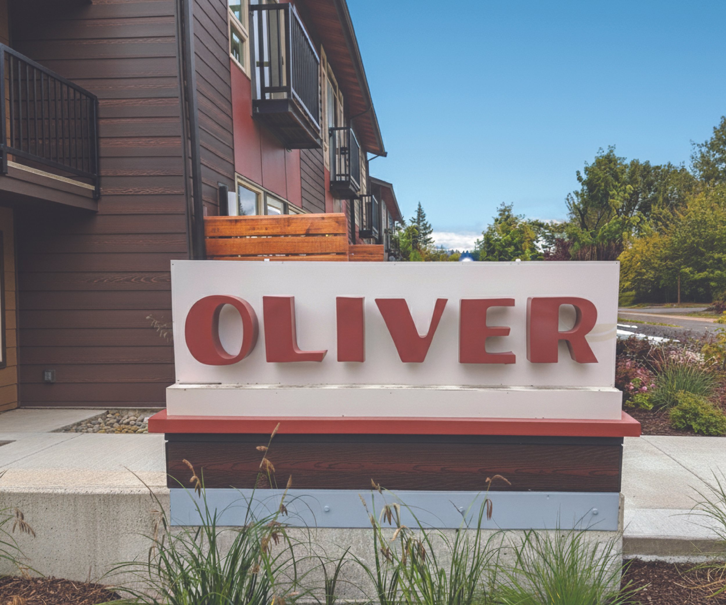
Environmental Graphics
Oliver Website
I collaborated closely with our web designer throughout the development to maintain a consistent brand identity across all platforms. Together, we ensured the client was satisfied with the final deliverables, delivering a cohesive and strong visual presence.

Web Design By Katelyn Fire + Flow Design Studio | fireandflowdesigns.com